


Ever since Tailwind first came out I have always been wary of it because it made my HTML look dirty. But after giving it a few trials, I fell in love with it 😊.
Introduction
Hi. My name is Johnbosco and I'm a self-taught front-end developer and an ardent lover of React I also help solve bugs for my friends. To practice my React skills, I decided to play around with the latest version of Nextjs, utilizing the experimental features and I stumbled on another nice library for building components.
Next13 and TailwindCSS
Utilizing Next13 app directory experimental feature which uses Server Components allows you to easily render components on the server and reduces the amount of JavaScript sent to the client.
React UI Libraries such as Material UI, emotion, and Chakra UI which are CSS-in-JS libraries that require runtime JavaScript is not currently supported in Server Components, so we are stuck with plain CSS or TailwindCSS for now.
After trying to build out components simply and neatly, I stumbled upon the class-variance-authority library. Simply called CVA, class-variance-authority helps you create type-safe variants with your "traditional" CSS or tailwind classes, while also helping you match classes to props.
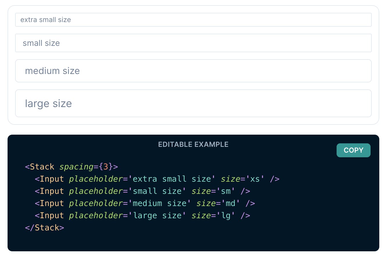
Now let's get down to business. Below is what we are going to recreate or something similar to it. The image below was gotten from Chakra-ui.
Project setup
Create a new next project following this guideline.
Install and configure TailwindCSS following this guideline.
Lastly, install CVA following this guideline.
Let's cook.
Let's get down to business so we create a component folder on our project base directory and create a file called input.tsx. Let's start by creating a simple reusable input element.
import React from "react";
function Input(
props: React.DetailedHTMLProps<
React.InputHTMLAttributes<HTMLInputElement>,
HTMLInputElement
>
) {
return <input {...props} />;
}
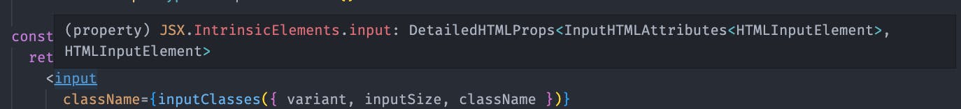
// The type for props are gotten when you hover over the custom input field just copy it and map it to your props check the image below for reference
export default Input;
How do we go from here to a customizable input field with which different variants and sizes can be passed as props while the input field conforms to these given props? CVA to the rescue.
import { VariantProps, cva } from "class-variance-authority";

// cva is just a higher order function that takes two arguments  the first is the array of base css classes while the second is a config object that contains our variants and defaultVariants objs, cva returns another function.

const inputClasses = cva(
  // the array below contains the default/base classes recieved by all input fields regardless of the props passed.
  [
    "rounded-md",
    "focus:ring-[2px]",
    "transition",
    "font-light",
    "duration-200",
    "ease-in-out",
    "outline-none",
    "w-full",
    "border",
    "ring-blue-500",
    "border-gray-300",
    "hover:border-gray-400",
    "placeholder:text-slate-600",
  ],
  {
    //inside the variants object is where we define our                   differents variants
    variants: {
      variant: {
        primary: ["bg-transparent", "text-slate-600"],
        secondary: ["bg-gray-100", "text-slate-900"],
      },
      inputSize: {
        xs: ["h-6", "text-xs", "px-2", "py-0"],
        sm: ["h-8", "text-sm", "px-2", "py-2"],
        md: ["h-10", "text-md", "px-2", "py-2"],
        lg: ["h-12", "text-lg", "px-2", "py-2"],
      },
    },
//These are the default values for our input fields if no variant or inputSize prop is passed
    defaultVariants: {
      variant: "primary",
      inputSize: "md",
    },
  }
);
// inputClasses is just a function that returns the classes for different variants.

//(a)
// inputClasses() return => "rounded-md focus:ring-[2px] transition font-light duration-200 ease-in-out outline-none w-full border ring-blue-500 border-gray-300 hover:border-gray-400 placeholder:text-slate-600 bg-transparent text-slate-600 h-10 text-md px-2 py-2"
//the above classes are gotten from bases classes and default variant and inputSize classes

// inputClasses({ variant: "secondary", inputSize: "xs" }) returns => "rounded-md focus:ring-[2px] transition font-light duration-200 ease-in-out outline-none w-full border ring-blue-500 border-gray-300 hover:border-gray-400 placeholder:text-slate-600 bg-gray-100 text-slate-900 h-6 text-xs px-2 py-0"

// we then pass this inputClasses to out input field className props like this className={inputClasses()} this just gives the input field the default classes shown in (a) above
Take time to read the code comments as it gives a better understanding of the code snippets
The inputClasses function defined above is where the magic happens. When it is called without arguments it returns the classes of the defaultVariants but if the variant or inputSize prop is changed from the default value it conforms to the selected value, eg changing the variant from the default value of primary to secondary or inputSize from md to xs.
Now we have our customizable input component that can be extended without conflict and code change. The code snippet below is the final state of our input component.
import { DetailedHTMLProps, InputHTMLAttributes } from "react";
import { VariantProps, cva } from "class-variance-authority";

const inputClasses = cva(
  [
    "rounded-md",
    "focus:ring-[2px]",
    "transition",
    "font-light",
    "duration-200",
    "ease-in-out",
    "outline-none",
    "w-full",
    "border",
    "ring-blue-500",
    "border-gray-300",
    "hover:border-gray-400",
    "placeholder:text-slate-600",
  ],
  {
    variants: {
      variant: {
        primary: ["bg-transparent", "text-slate-600"],
        secondary: ["bg-gray-100", "text-slate-900"],
      },
      inputSize: {
        xs: ["h-6", "text-xs", "px-2", "py-0"],
        sm: ["h-8", "text-sm", "px-2", "py-2"],
        md: ["h-10", "text-md", "px-2", "py-2"],
        lg: ["h-12", "text-lg", "px-2", "py-2"],
      },
    },
    defaultVariants: {
      variant: "primary",
      inputSize: "md",
    },
  }
);

// below here we just extended our input base interface and VariantProps interface which we imported from CVA
export interface InputProps
  extends DetailedHTMLProps<
      InputHTMLAttributes<HTMLInputElement>,
      HTMLInputElement
    >,
    VariantProps<typeof inputClasses> {}

const Input = ({ className, variant, inputSize, ...props }: InputProps) => {
  return (
    <input
      className={inputClasses({ variant, inputSize, className })}
      {...props}
    />
  );
};

export default Input;
Result
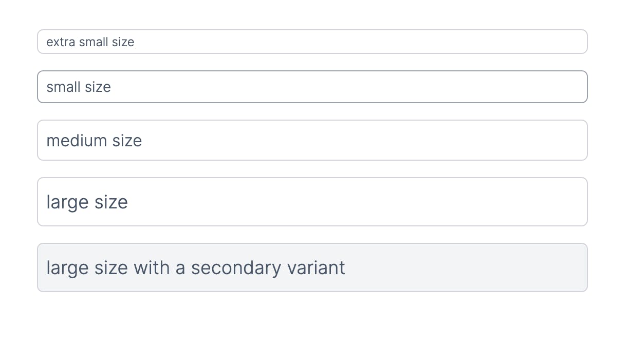
The image below shows the UI representation of how the input field turns out based on the props passed to it.
import Input from "@/components/input";

function Page() {
  return (
    <div className="p-8 mx-auto flex flex-col gap-4 flex-1 w-full max-w-[600px]">
      <Input placeholder="extra small size" inputSize="xs" />
      <Input placeholder="small size" inputSize="sm" />
      <Input placeholder="medium size" inputSize="md" />
      <Input placeholder="large size" inputSize="lg" />
      <Input
        placeholder="large size with a secondary variant"
        inputSize="lg"
        variant="secondary"
      />
    </div>
  );
}

export default SingleProject;
Conclusion
As I have exposed here, I believe there are advantages when using class-variance-authority to build fully extensible and type-safe components with TailwindCSS or traditional CSS.
Thank you for reading 🕊
Code
Here is the link to the code on CodeSandBox https://codesandbox.io/p/sandbox/xenodochial-cherry-uibei0
Reference
TailwindCSS official website https://tailwindcss.com/docs
Class variance authority website https://cva.style/docs